How search engine optimization (SEO) data is displayed can be the difference between your report getting read or not. Create a simple and stylish SEO dashboard using Google Looker Studio in 4 steps.
Sometimes it’s not what you show, but how you show it that can make a difference – and presenting data is no different. The way in which it’s illustrated can sometimes be the difference between someone reading your report – and not.
That’s why using data visualization tools such as Google Looker Studio (formerly Google Data Studio) has been a godsend for many SEO professionals. It’s a powerful tool to gain valuable insights by creating customized and mostly automated reports that are visually appealing.
And while the free template options they offer may be fine and dandy for some, they’re not always the best option for all. It’s sometimes necessary to create a simpler and more custom dashboard based on your client’s goals and desired KPIs.
Reporting Before Google Looker Studio
Prior to using Google Looker Studio, I used good ole fashion Excel. There would be different tabs for the various performance metrics. There was also a ‘data dump’ tab that would auto-populate all the other tabs with updated metrics.
Here are a couple of examples of what that used to look like:
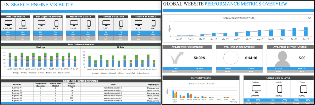
Extended image description
Side-by-side analytics screenshots compare U.S. Search Engine Visibility with a Global Website Performance Metrics Overview. For U.S Search Engine Visibility, there are 3 sections of graphics.
The first section compares Desktop and Mobile M, O, M and Y, O, Y analytics for the following 5 categories: Data Cube Score, Total Organic Keywords, Ranked on S, E, R, P 1, Ranked on S, E, R, P 2, Ranked on S, E, R, P 3.
The second section compares Total Universal Results for Desktop and Mobile with side-by-side stacked bar charts and monthly data for 2017. The bar charts rise and fall with stacked sections for Images, Videos, Carousel, Places, Local 3 Pack and Quick Answers.
The third section includes a table of Select High Ranking Keywords. Data points are provided for Google Rank Desktop, Google Rank Mobile, Search Volume, Page, and Result Type. For Global Website Performance Metrics, there are 3 sections of graphics.
The first section is a bar chart that shows 2017 Organic Search Website Visits in millions with a Y, O, Y trend line. The graph shows the numbers steadily increasing from January to December 2017. The Y, O, Y trend line is just below the top of each bar with a slight dip in November.
The second section shows M, O, M and Y, O, Y analytics for Average Bounce Rate (Organic), Average Time on Site (Organic), and Average Pages per Visit (Organic).
The third Section compares a bar chart for Y, O, Y Site Visits by Source for December 2016, November 2017, and December 2017 with analytics data for M, O, M and Y, O, Y Organic Visits by Device.
Pretty, right?
Similar to my Excel reports, the approach to creating a stylish Google Looker Studio report is the same. For the sake of this article, I will focus on how to create a pretty slide in a simple SEO performance reporting template.
STEP 1: Map out the important metrics to include
Depending on who will be receiving this SEO dashboard, make a list of all the site performance metrics that your audience wants to see.
Your list can look something like this:
- Overall website engagement: sessions, pageviews, pages / session, bounce rate, % new users, and average session duration.
- Default channel grouping breakdown: % breakdown, referral traffic sources breakdown, and other traffic sources, etc.
- Goal completion breakdown: total goal completions, goal conversion rate, and goal completion location
- Organic traffic breakdown: sessions, pageviews, bounce rate, events, goals, devices, and landing pages.
- Search engagement breakdown: impressions, clicks, click-through rate, average position, and top search queries by clicks.
- Technical site audit breakdown: # status codes, # error types, and delta.
- Keyword ranking positions: keyword rankings summary, top keyword ranking increases, and top keyword ranking decreases.
- Link building breakdown: # backlinks, # referring domains, # new links and date found, and # lost links and date lost.
…and so forth.
You’ll also want to consider the different data sources that will need to be incorporated into your comprehensive dashboard. This may include YouTube analytics, Google Sheets, Google Ads, Google Search Console, Google Analytics, and more. This may impact what goes into your report.
STEP 2: Outline the look and feel of your report
Now it’s time to map out how all those important SEO metrics will fit within your report. I like to start from the ground up: meaning I’ll start with the background, then add layers of design elements and charts.
The first step is deciding on a report background color. I highly recommend sticking with a light background with dark letters. I do not prefer using a dark background with light letters. That’s because it’s easier on the eyes, and it’s also easier on a printer should someone need to print it.
To do this, click on “Customize” in the Theme and Layout panel. Then select a background color. In my report I’m going to use a light grey.
Transcript: Customize Background Color Video
Cursor moves to click customize, switching to edit theme.
User clicks the drop-down report background expanding a color grid to change the color.
Then add a banner to the top with what the slide is about. To do this, add a shape box followed by a text box. Both are located in the top navigation.
Transcript: Add Banner Video
The background is changed to a custom color.
The text is highlighted within the box, then changes from a default to 14 to 24 pixel font size in Text Properties.
Next, you can add boxes that will outline where charts will go (before you add the charts themselves). To do this, use shapes and text boxes. I also recommend only having a few data points per slide as to not overwhelm the reader.
Keep on plugging away until you have everything mapped out. You can go a step further and add text boxes for where you plan to have everything.
Transcript: Add Text Boxes Video
A smaller rectangle is drawn below the first on the left third of the grid.
Again, color changes to white.
With small rectangle selected, a quick copy paste creates an identical rectangle that is dragged and aligned below.
With both rectangles selected, an identical vertical pair is dragged to the right of the original pair.
The same copy paste action repeats to create a 2×3 grid of six rectangles.
User selects Rectangle from Shapes then creates a title bar across the top of the first block.
User selects Text Box to draw and center a box within the title bar.
Font color changes to white and “overall traffic” is typed into the text box.
STEP 3: Add desired charts to the outlined report
Now it’s time to create your SEO dashboards the way you envisioned it. For the bar chart, you’ll need to click on “Add a chart” and then select “time series chart.”
Transcript: Bar Chart Video
Page now shows titles added to all blocks.
User types in the search bar, filters options, and selects the Time Dimension, Month of the Year.
User clicks the Date Range drop-down to change from a default of Last 28 days to Advanced.
Start and end date filters appear with selections for Start Date, Range, Number, and Time Frame.
Values change to a Start Date of Today minus 12 months and an End Date of Today minus 1 month.
After clicking apply, the Time Series chart changes to the custom date range.
The chart changes to a bar chart.
The other thing you’ll want to do is add a date range control. That will allow the data to auto-populate in the future and provide a more comparative SEO analysis.
This can especially come in handy should you share the Looker Studio link and someone want to adjust the timeframe with a filter.
For the rest of the boxes, I will use hard numbers and add month-over-month (MoM) and year-over-year (YoY) deltas. To do this, click on “Add a chart” and then select “scorecard.”
Unfortunately, as of writing this article, there is no simple way to add both MoM and YoY data with one scorecard. You can only select one timeframe at a time. There are ways around it, which I’ll explain in a different post.
Fortunately, there’s a workaround for this by duplicating the scorecard and overlaying one over the other. Just make sure to give your scorecard a background color so it can hide the contents of the other card.
Transcript: Add a Scorecard Video
User selects the first Scorecard chart from the Add a Chart drop-down, then drags and resizes the chart to fill the Sessions block just below Overall Traffic Sessions.
The Scorecard value then changes from New Users to Sessions.
Date range changes from a default of Last 28 Days to Last Month.
User clicks apply, and the Session Scorecard changes from 371 to 295.
Comparison Date Range reveals start and end date calendars.
User selects Previous Period to add a change percentage.
User toggles from Data to Style, unselects Hide Comparison Label which adds From Previous Month next to change percentage.
User scrolls Style and selects Hide Metric Name to remove the Sessions label.
Cursor moves down the panel to center justify Metric Name, Value, and Comparison, and change the background color to white.
User clicks on Scorecard and selects Duplicate with a secondary click.
User clicks on the duplicated Scorecard and selects Send Backward with a secondary click.
User toggles to Data to change the Date Range to Custom and the Period to Previous Year.
Clicking Apply changes the duplicated Scorecard Metric from Previous Month to Previous Year.
Keep plugging away at this until all the other boxes look exactly the way you want. When all is said and done, this one SEO dashboard example will look like this:
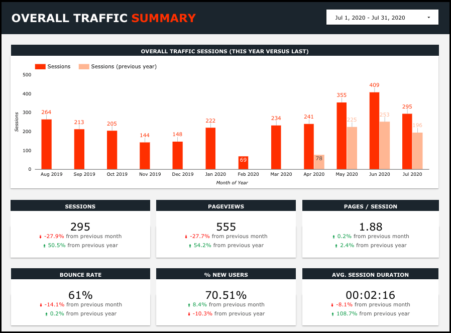
Extended image description
A screenshot of a MediaSesh analytics page for the Google Data Studio Overall Traffic Summary. The date range at the top right corner reads, July 1, 2020 to July 31, 2020.
Below this, a bar chart shows M, O, M data for Overall Traffic Sessions this year versus last. The X-axis shows Month of Year and the Y-axis shows Sessions from zero to 500.
We can see comparison data from April to July 2020 for this example.
Below this, summary data analytics with M, O, M and Y, O, Y Change Percentages for the following 6 categories: Sessions, Page Views, Pages / Sessions, Bounce Rate, Percentage New Users, Average Session Duration.
Follow this same approach for all the other slides.
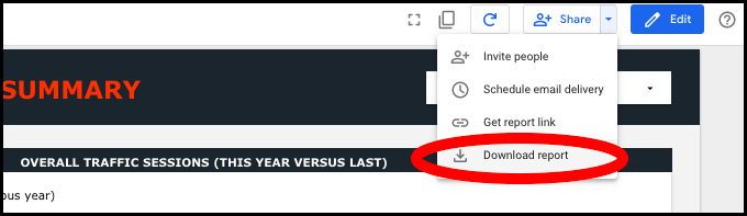
STEP 4: Share and/or download a PDF of your report
Once everything looks good, then it’s time to either share the link or PDF it. I will usually PDF it and email it to the client.
Final Thoughts
As you can see, putting together stylish SEO report templates takes time, but it’s really easy if you follow the four steps I mentioned: outline the important metrics first, then map out how it will look in Google Looker Studio, add the charts, then download.
I will also include a title slide and executive summary slide in my monthly SEO templates. The executive summary should pull out insights of data from the rest of the report. This is where you’ll interpret the findings to inform data-driven decisions. Outline it to say what happened, what caused it to happen, and what your next steps are.
You can also consider an appendix if needed in your Looker Studio dashboard. That way you can use the first few slides for the high-level strategic insights, which leadership may want to see and leave the appendix for the more granular data, which the sales and marketing teams may want to see.
Now go forth and create some really simple, stylish, and impactful reports!
If you need a place to start, check out these Google Looker Studio templates for Google Analytics 4 (GA4) and Google Search Console (GSC).
Related Articles: