Google Analytics is only as good as the person using it. Learn more about what questions to ask, dashboards to review, and how to craft actionable next steps.
Google Analytics is a powerful data analytics platform that enables business owners to make impactful business decisions based on data.
Similar to other tools, Google Analytics is only as good as the person using it. While beginners will be fixated on the number of visits and whether it went up or down, it’s what you do with it that makes a difference.
This is where it’s time to really start to derive actionable next steps based on the data and understand how your audience is engaging with your website.
This article will go over the very basics to help get you started. By the end, you should know the benefits of Google Analytics, how to interpret data, and how to create next-step recommendations.
You can also view the video in webinar format below:
Download Introduction to Google Analytics Transcript
The Benefits of Google Analytics
There are five main reasons why I love using Google Analytics:
- It allows you to define key metrics that are important to your business.
This is where you would have to ask yourself: “why does your business exist” or “why the business you work at exists” or “why does your client’s business exist and why do you want to track performance data.”
For example, you may be curious to know how many people are signing up for your e-newsletter or how many people are purchasing the product. It really helps you to become a little bit more laser-focused on your business goals and objectives. - It allows you to spot threats and opportunities.
This is where you can look for any potential anomalies, whether it’s good or bad. For example, you discover there’s an influx of traffic coming to your website and discover it was caused by spam. That can have an impact on your next step recommendations. - Provide insights into what’s happening in the business.
I don’t know about many of you, but oftentimes my clients don’t always notify me of the kind of work that they’re doing. Sometimes they don’t really know what they should keep me privy on.
Even if they don’t tell me, I can sometimes discover what happened when putting my monthly reports together. I’ll tell them what I’ve discovered and they can tell me what they have worked on. It can show my value and become a more trusted adviser.
- It helps to create a framework for making smarter decisions.
If you’re a small business owner, you wear many hats. If you’re part of an internal marketing team, you are tasked with a lot of stuff. When you’re creating a framework for making smarter decisions, this helps you to prioritize the tasks in which you want to accomplish. - Learn from your successes and failures.
This will help you to see what worked and what didn’t. This can be true if you updated your website, possibly gone through with a whole new rebrand, or maybe you went through a site migration. There are many activities that will have an impact on performance metrics.
How Google Analytics can help with Creative Confidence
Creative confidence is an amazing way to approach problem-solving. It’s a way to continually improve, so you’re never really done. This can be a really helpful approach for the perfectionist. We let go of the end product knowing that we’re always going to be improving.
Creative confidence is a naturally expansive way of doing business. You’re constantly growing and you’re starting with a growth mindset. As opposed to a fixed mindset, which says we’re stuck exactly the way we are and we should keep repeating the same thing over and over again.
Stanford Business School even created an entire postgraduate program based on the Creative Confidence process.
Here are a few ways in which Google Analytics can help with creative confidence:
- It will help encourage a way to experiment with new approaches and solutions.
I mentioned how Google Analytics can help with learning from your successes and your failures. This has a little bit to do with that, as well as seeing what works for your business and what doesn’t. - It will create a new mindset to enhance the life of your business.
For me, this means thinking about my website visitors and how they’re engaging with my website, and what I could do next to offer them value. - Google Analytics is both an art and a science.
It’s a science because it provides the numbers and gives you the data. But it’s also an art because now you could get creative and think about what next step recommendations you can provide your business or your clients.
Data can help tell a story that’s incredibly useful in terms of creative confidence and design thinking. This is a very high-level concept that then can get distilled into a strategy.
If you’re interested in learning more about Creative Confidence and incorporating it into your business, reach out to Nicole BZ Business Consulting. She is an extraordinary business coach that contributed her knowledge on this subject during our webinar.
The Four Main Areas of Google Analytics
There are several sections in Google Analytics, but I would say there are four main ones.
- AUDIENCE
This helps to answer the questions of who your website visitors are. The questions could be: Are they male or female? Where are they located? What devices are they using (devices meaning desktop, tablet, or mobile)? And what are they interested in? - ACQUISITION
This looks at how people got to your website. This would show how many visitors you got from Facebook (or social media in general). Did people find your website because of SEO, PPC, email marketing, referral, etc.? - BEHAVIOR
This looks at what visitors did once they got to your website. This could include the pages that they looked at, if they used your search box, and what they were looking for. It can also help with some content generation ideas. This can help give an indication if your visitors had a good user experience to generate next-step ideas. - CONVERSIONS
This will tell us the action that visitors took when they were on your website. If you’re new to Google Analytics, this section is normally blank. That’s because Google Analytics doesn’t know what’s important to your business. You will have to add the criteria so then this data can begin to populate. If you do, it begins to add layers to your data and help to really shape what story is being told.
Google Analytics Buzzwords
There is no shortage of buzzwords when using Google Analytics. Here are a few to get started since I mention them in this article:
- Source: The exact place where the traffic originated (e.g. Facebook)
- Medium: The general category of the source (e.g. Social)
- Sessions: The number of visits and interactions from one user
- Pageviews: The total number of pages that were viewed
- Landing page: The first page that site visitors land on
- Bounce rate: The % of visitors that “bounced” after one page
- Conversion: A completed action by site visitors (e.g. purchase)
- Primary dimension: The attribute of site visitors (e.g. Country, Device, etc.)
- Secondary dimension: A second layer of information about the primary dimension
The Three “What” Questions to Ask When Viewing Data
Usually when I look at data, whether it’s Google Analytics, Facebook analytics, Omniture, etc., there are three questions I like to ask:
- What happened?
- What caused it to happen?
- What should I do next?
Here’s an example: Let’s say you were looking in Google Analytics and you noticed a very noticeable spike in traffic on February 28th – this answers the question of what happened.
You start to dig a little bit deeper, and you realize there was a correlation between traffic increasing because someone within the organization had launched a paid social campaign on that exact day. This answers what caused it to happen.
What should you do now? Well, you discovered that this had resulted in 50 new leads. Maybe that says that you should run this campaign again. However, depending on your business, you might also decide that 50 new leads weren’t enough and that you might want to change the campaign. It really all depends on your goals for launching different marketing campaigns.
Here’s another example: Let’s say you started to notice that organic traffic had started to decrease in November of 2019. Again, this answers the question of what happened.
You might start to do a little bit of digging and notice that this correlated around the same time that Google announced a major algorithm update. In this case, BERT had been released in October 2019. This might answer what caused it to happen.
As far as the next steps, you may want to revisit content to confirm that it follows Google’s best practices. You may also want to dig deeper to confirm if any website changes have occurred.
I’ll provide actual client examples in a later section.
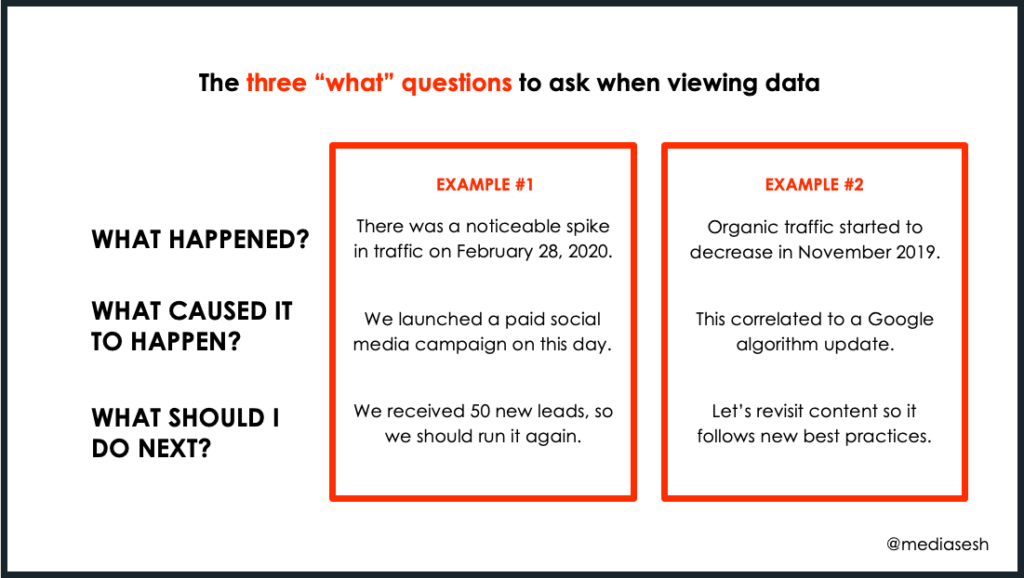
Extended image description
A MediaSesh branded infographic with a title that reads, “The three ‘what’ questions to ask when viewing data”.
Below this, 2 side-by-side examples comparing information for three questions as follows:
1. What Happened?
Example 1. There was a noticeable spike in traffic on February 28, 2020.
Example 2. Organic traffic started to decrease in November 2019.
2. What Caused it to Happen?
Example 1. We launched a paid social media campaign on this day.
Example 2. This correlated to a Google algorithm update.
3. What Should I Do Next?
Example 1. We received 50 new leads, so we should run it again.
Example 2. Let’s revisit content so it follows new best practices.
Things to Keep in Mind When Looking at Data
When you’re asking yourself the three “what” questions, I want you to keep a few things in mind. That’s because I believe these will inevitably come up during the course of your GA journey.
- Look for noticeable increases and decreases in data. That’s how you can quickly spot threats and opportunities.
When I look at Google Analytics, I look for those metrics that jump out. I will ask myself “what looks interesting?” This usually means something stands out and it has caught my attention. It can sometimes warrant a deeper dive. - Sometimes, there doesn’t appear to be a clear reason as to why there were shifts in performance metrics data.
There are times you may be racking your brain trying to understand why traffic did what it did. You might start your deep dive analysis and for some reason, nothing is abundantly clear as to why traffic shifted.
In cases like this, I will just keep an eye on metrics. I may not do anything right away since there’s not enough information to make any significant changes just yet. It’s also possible that it’s a random anomaly with the data. - Answering “what caused it to happen” can take the longest amount of time because it takes analysis and deep dives.
The reason for what caused traffic to move doesn’t always come by just looking at the data. Sometimes doing deep dives for one chart could take me even an hour, sometimes longer. Please note that this is completely normal.
For example, let’s say there was a spike in traffic for just one day. You had checked with your team members and used a number of different tools, but there’s just no real reason why traffic did what it did.
Or there is a reason, but you’ve already invested a lot of time in trying to uncover it. Depending on what happened, I will usually move on and keep an eye out for traffic going forward. Sometimes the answer comes in the following report. - Insights can usually only be derived if there is a good sample size of data. Sites with no traffic are harder to interpret.
I can usually only derive good insights if there is a good sample size of data. For example, if your website is generating about 50 visits a month, it’s a small number where I might not suggest any significant changes on the site. Wait a few months for more site visits before crafting next steps. - Sometimes, there might not be a next step based on the data. An example would be if traffic remains flat month over month.
There are times when some of the data doesn’t suggest next steps. This can happen when there are no changes made to the website, no seasonality, no core or major algorithm update, no campaign launch, etc. Traffic may have just remained flat. Data may not suggest a deep-dive investigation. And that’s ok. - You may need to use other tools to help with uncovering why there were performance metrics shifts (e.g. Google Trends).
Google Analytics sometimes on its own is not enough to answer why traffic did what it did. This is where you may need to look at other tools, such as Google Trends or Semrush, together with Google Analytics to help make correlations.
The Importance of Adding Layers to Data
When it comes to data, you’ll want to do two things:
- Figure out what question you want to answer and
- Add layers to your data to see what story is being told
For example, one of the questions I might want to answer is how many visits my website received from Facebook. I’ll make my way over to that dashboard (Acquisition >> All Traffic >> Channels >> Social). Let’s say you discovered your site generated 50,000 visits for the month of March. But what does that tell you? How do you know if that’s good or bad?
The next step would be to compare it against another timeframe, such as February. Perhaps in February, you received 25,000. Now we’re starting to see that something interesting is going on. Then we can start to ask, why did this happen?
Another step could be adding a secondary dimension. In this case, I’ll add one for landing pages. That will then tell me what pages people viewed on my website from Facebook in March versus February. There may be a few good reasons as to why that happened that will inform next steps.
NOTE: As you may have noticed, the example above and the ones below use Universal Analytics examples. I plan on updating this post one day to GA4.
Three Dashboards to Look at in Google Analytics
Google Analytics provides many great dashboards to view insights. Here are three dashboards to get you started.
Dashboard #1: Traffic Sources Breakdown
The first question I want to answer is how visitors are finding my website. Is it through SEO, social media, or email marketing? I want to know how they’re finding me.
To see this in Google Analytics, you’ll need to:
- Click on Acquisition (in the left navigation)
- Click on All Traffic
- Click on Channels
This alone will not tell me much. As mentioned, insights are derived when you add layers to the data. The next step is to add a timeframe for comparisons. In my reports, I usually like to report on both month-over-month (MoM) and year-over-year (YoY) data.
Look for those data points that look interesting. In this example I thought there were three interesting discoveries:
- Organic traffic increased 52% MoM (100 vs 66)
For this particular client, we started pumping out more content. Even though the sample size was small, traffic increasing after only working together for one month was a good start. - Social traffic increased 950% MoM (63 vs 6)
As I mentioned, the sample size is small. But what’s interesting is that this increase correlated to more posts going up on their social media platforms. This could make the case for posting and engaging more on social media. - Social bounce rate decreased by 29% MoM (71% vs 100%)
The bounce rate is when someone comes to your site and doesn’t visit a second one. The higher the bounce rate, the more people left after viewing one page. In this case, we correlated that more content on social media was leading to better performance metrics on the website.
Dashboard #2: Top Landing Pages
The next question I want to know is what are the top landing pages on the site. Is it the homepage or is it a blog page? I want to know what people are reading.
To see this in Google Analytics, you’ll need to:
- Click on Behavior (in the left navigation)
- Click on Site Content
- Click on Landing Pages
As I mentioned above, this alone will not tell me much. I need to add a timeframe comparison. In this example, I’ll use February this year versus February of last year to show year over year.
I am going to add an additional layer on top of that. I also want to know how they got there, whether it be through social media, email marketing, organic search, etc.
To find this:
- Click on Secondary Dimension
- Click on Medium (or Default Channel Groupings)
When I look for the data points that look interesting, here’s what I get:
- Organic traffic to the homepage increased 79% YoY (77 vs 43)
Again, the sample size is small, but it can still possibly suggest good next steps. Since traffic to the homepage increased the most, I’ll want to know if anything on this page changed. It’s also possible that for now, the only next step is to monitor it to see what happens next. - The pages per session for referral traffic increased 254% YoY (4.45 vs 1.26)
It’s interesting that we went from someone looking at almost 1 ½ pages per visit to almost 4 ½ pages. Since the sample size is small, I may just keep an eye out on this going forward to see what next steps I can possibly create in the future.
Dashboard #3: Goal Completions
The final question I want to answer for now is how many visitors are engaging and converting on the website. I want to know what action they took.
There are a few ways you can find this information, but for simplicity sake, I’m going to follow the same steps from dashboard #1. The only difference is I’m going to look at a different client and also look at it for the full year over year (this year versus last year).
When I look at this dashboard, there’s one insight that looks interesting:
- Goal completions for Direct traffic increased 48% YoY (145,628 vs 98,126)
It was interesting to see that goal completions had gone up even though sessions had decreased. This is where I’ll want to do a deeper dive to understand why and how this happened.
Hopefully, these dashboards provide a good starting point for how to add layers to your data to create next steps. Google Analytics provides a whole bunch of dashboards, so use what you’ve learned for these three and apply them there.
The other thing I want to point out is that I usually like to include hard numbers and percentages, especially if it’s a small sample size. That’s because percentages can appear inflated otherwise.
For example, let’s say one month you have one visitor and then the following month you have two visitors. Well, then your month-over-month change is 100%. This means some numbers can look inflated.I want to point out that you might have called out three different interesting data points. And that’s ok!
Questions to Ask to Help Inform Next Steps
Asking questions is one way to help craft impactful next-step decisions based on the data. Usually, when I’m trying to think of why something happened, I’ll ask myself questions that include:
- Is there enough content on the page?
Ask yourself if there is enough content and is it providing value. If your landing page features a short blog with one paragraph, that may run the risk of someone leaving because it didn’t entice them to stay and go to a second page. Alternatively, the visitor may have gotten what they needed and didn’t need any more information. - Is the content skimmable and readable?
This asks if the content is visually appealing since sometimes it’s not what you say but how you show it that can make a difference. You’ll want to think about how to make this article look more visually appealing by adding quote blocks, images, videos, short paragraphs, bullet points, and subheadings.
That’s because as much as we want everyone to read every single word of our article, chances are they’re not going to. For this reason, we’ll want to make it easy for them to be able to skim the article, get value and possibly convert before they leave. - Is the content relevant to what the visitor would expect to see?
Let’s say you post something on Facebook. If your post says “this article is about XX” and someone clicks through and the article is about YY – that can result in a poor user experience. You run the risk of them leaving your website right away. - Is there a clear next step for the user to take?
This is where you’ll want to have noticeable calls to action. It can include a newsletter box or a form to download an ebook or white paper. You’ll want to think of various conversion points to test in order to keep your audience engaged once you have them. You worked so hard to get them to your site and they’re finally here. Think of ways to keep them on the site and get them coming back. - Is your page something that is searchable?
When it comes to SEO, it’s not necessary to get super creative with article titles – just say what the article is about. You usually want to just get straight to the point. For example, let’s say you have an article with a few social media tips to increase conversion rates, your article title can say just that. - Is the target keyword(s) mentioned throughout the content
When I include my target keywords throughout the body of my copy and important SEO fields, that helps to tell search engines and visitors what this page is about.
Activities That Can Impact Performance Metrics
Other activities that can impact website traffic include other factors – both online and offline. Here are a few examples:
- Online activities
- There was a potential Google algorithm update
- You began or ramped up a PPC campaign
- You distributed a new email marketing campaign
- You started or increased a paid social campaign
- Offline activities
- You or a member of your team had attended a trade show and gave out a whole lot of business cards
- You or a member of your team presented at a conference
- Your company-sponsored an event and your logo is everywhere
Use Other Tools Together with Google Analytics
I had mentioned earlier that sometimes Google Analytics on its own is not enough to tell you why traffic moved. You may need to use some other tools together with Google Analytics to tell you a more complete picture.
For example, let’s say you distributed an email campaign. You’ll be able to grab insights about the number of email impressions and clicks from your email marketing platform only. This is not information that is provided in Google Analytics.
By grabbing insights from multiple tools, you’ll be able to create more assumptions about how visitors are engaging with your website. Based on these engagement metrics, will help to inform more informed next-step decisions.
Here are a few examples of tools you can use:
- SEO: Google Search Trends, Google Search Console
- Email marketing: MailChimp, Active Campaign, Constant Contact
- Paid search: Google AdWords
- Social media: Sprout Social, Social Mention, Sprinklr
Client Examples Using the Three “What” Questions
It is our responsibility to craft insights for our clients. Here are a few examples of my client insights using the three “what” questions: 1) what happened 2) what caused it to happen and 3) what do I do next?
Example #1: Explaining an organic traffic decrease
When traffic goes down, you’ll want to understand why that’s the case. In this example, I give reasons for the decrease and what I plan to do about it.
Visits from organic search decreased 21% MoM, but increased 2% YoY.

The decrease MoM correlated to seasonality and was expected since a similar trend occurred this same time last year.

Google also announced a potential bug with Google Analytics that may have had a small impact on performance metrics. We don’t believe this to be the case, but we’ll keep an eye on metrics to confirm.

Organic traffic is expected to increase again in January based on historical data in Google Analytics. We will keep an eye on traffic and provide an update in next month’s report.
Fast forward to the following month when traffic was expected to increase, it did not. Because of that, I had to do an even deeper dive to uncover what may have really caused the traffic decrease.
The lesson here is that even when you come up with one potential reason or next step, come back to it. Sometimes our original theories are not the answer and we need to dig deeper.
Example #2: Explaining an organic traffic increase
This next example is for a client that’s in the higher education space. I ended up using Google Search Trends to help craft this insight.
Visits from organic search increased 47% MoM, decreased 6% YoY.

The traffic increase MoM was due to seasonality since according to Google Trends, January is peak time for “summer programs for high school students” searches.

However, that peak had decreased slightly YoY the last five years. This could explain the decrease YoY since organic traffic to the homepage decreased 24% YoY.

We will review this section to ensure it’s fully optimized. We’ll also provide content topic ideas to maximize the number of inbound visits from organic search given this trend.
This insight hopefully shows the client that traffic decreasing YoY has nothing to do with them. It has to do with fewer searches happening as a whole for the type of program they offer. It means that even competitors should be seeing fewer visits because of this.
Despite this, I want to ensure we’re maximizing our exposure and reach our fullest potential in Google. Let’s still try to capture what traffic we can.
Example #3: Explaining the impact of COVID-19
This final example helps to highlight how COVID-19 had an impact on performance metrics.
Visits from organic search decreased 13% MoM and 59% YoY.

1) There might be a small correlation to a core algorithm update that occurred in February.

• Per usual, Google mostly only recommended having great content, highlighting experience, and being an expert in the industry. However, we believe it had more to do with the next bullet point.

2) There was a strong correlation to organic traffic decreasing because of COVID-19 since traffic this year was trending lower than the same timeframe last year.

• Looking back, we believe traffic decreased in January and February because other countries were dealing with COVID-19 before the U.S., and according to Google Analytics, almost half of visitors are from outside the U.S.

• Additionally, traffic patterns notably began to falter around the middle of March, which coincided with the U.S. declaring a state of emergency and had remained low since then.

• We will provide content topics based on new search trends to address the types of questions your visitors have during this uncertain time.
What this insight taught me is that the real reason for traffic movements may not come right away. I wasn’t able to see how COVID was impacting my client’s business in January or February. It took me until March when our own country was experiencing COVID for the aha moment. I finally was able to see what the data was trying to tell me.
Final Thoughts
My hope for this introduction is that it gives you a starting foundation for how to use Google Analytics to interpret your data and craft next steps. Please keep in mind that whenever you learn something new there’s going to be a learning curve.
If you’re new to Google Analytics, my only ask is for you to be kind to yourself. Give yourself patience. Keep track of your experience using Google Analytics today and compare that to where you are next year. I promise you’re going to see a world of difference. You can also check out some of my Looker Studio templates to help spot trends, uncover anomalies, and identify next step opportunities.
Related Articles